
Documentation Zine - Documentation & Evaluate


I received my books a few days ago, seeing them on a screen and seeing them in person is an entirely different matter. Overall i am really pleased with the overall aesthetic of the book but if i where to produce again then there would be a few things that i would change.


  • the writing on the inner pages is too large for the pages, i understand that this was done so that the pages wouldn't look to bare having the writing small and central. In the future i would make sure to check the font size by printing off some text on normal paper to evaluate.
  • I am really pleased with the texture of the paper - it was good idea to wait and source example paper to get a feel of exactly how the paper would be in print form. I was unsure about the gloss at first as i didn't want it to look too much like a magazine however in person it elevates the images making them look high quality and professional. 
  • The front page is exactly how i envisaged i didn't want to select a single piece of artwork for the front as i believe all my work has helped shape me as an artist. Instead the designer created this snippet of my work which i think flows nicely. Initially this was going to be extended to the back page however when testing this it distorted the images and didn't look as professional. 
  • I didn't include my work this year which explored texturing with fabric, these installations influenced my creative practise in a way that makes me not want to produce anything with fabric again. To include the fabric in my documentation book would be for a negative reason and i don't wish to include failed attempts or irrelevant information in the book. 
  • Unfortunately there are two blank pages at the back of the book which i didn't account for. This was because the book had an odd amount of pages resulting in the blank pages. Although this isn't a massive issue it is something to consider were i to do this again. 
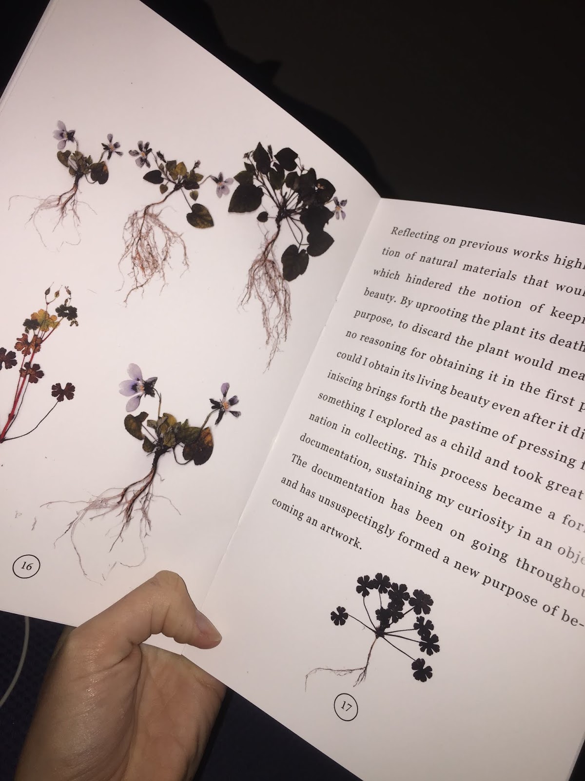
  • i was slightly worried that the scanned images of my pressed plants were blurry or too dark for print however with them being on gloss paper i actually really like that high contrast. 
  • The design for the book took influences from some botanical books i provide which i think is visible within this zine. The numbers at the bottom of the page as well as the images above the subtitle pages are representative history botanical books. I think the aethetiv of the book is clean and crisp with hints of botanic books which is exactly what i wanted from it. 


Comments

Popular posts from this blog

Teach First Application - LO6 - Evidence

Evidence in LO6 Folder Application Process Sections to the application: ·          Registration ·          Pre-university academics ·          University academics ·          Competency questions ·          Situational judgement test ·          Supporting information ·          Programme preferences Registration Within the registration process I uploaded my basic information allowing them to contact me with possible job opportunities. This information was things such as name, address and contact details. Pre-University academics ·          A Level, As Level & UK equivalent ·          GCSEs, IGSCEs or UK equivalent ·          O-levels, other UK, or non-UK qualifications University academics ·          First degree studied ·          Modules                                         Competency questions Each question below had to be answered in 250 words or less.     Understanding and motivation Wh

Abramovic Case Study - Research & Evaluation

Performance artist Marina Abramovic adopts a territory where both audience and artist coincide throughout the entirety of her performance. Abramovic’s early career commenced during the 1970’s an era where performance art was ridiculed, only fuelling her aspirations to prove critics wrong. Abramovic’s rhythm series, which constitutes of five individual performances from 1973 to 1974, scrutinizes the tensions between abandonment and control. At the forefront of Abramovic’s rhythm series is Rhythm 10 (Abramovic, M. 1973). Rhythm 10 consisted of Abramovic recording herself stabbing between the fingers of her left hand with 10 knives, as fast as she could; changing knives every time she cut herself. When all knives were used Abramovic would rewind the tape and playing it back, she then began re-performing the actions to the rhythm of the tape. Abramovic wilfully or not, subjected her performance to a rhythm over which she had limited control. Abramovic claims each cut manifesting itse

Bishops Art Prize what i am proposing - reflection & critical evaluation

Having not know what i was going to produce for the bishops art prize for most of this unit i am extremely happy with the outcome i have produce. I wanted to carry on developing my practise by exploring different casting styles which is exactly what i have done.  When i first brought the idea to the 3D workshop technicians they dismissed the possibilities of casting an organic form in concrete. Not wanting to fall at the first hurdle i began researching to see if anything like this has been done before with not much luck. After having further discussions with the technicians and drawing up possible options we came up with a process that seemed to be the most logical. At first i present the technicians with rather complicated plants to mould - this was a result of me not knowing the mould making process for silicone moulds and thus had to go back and get some organic material that was a lot easier suited to the casting process. Still not knowing for sure if the mould would work